Thursday 30 May 2013

Foundation pieces 2012-2013


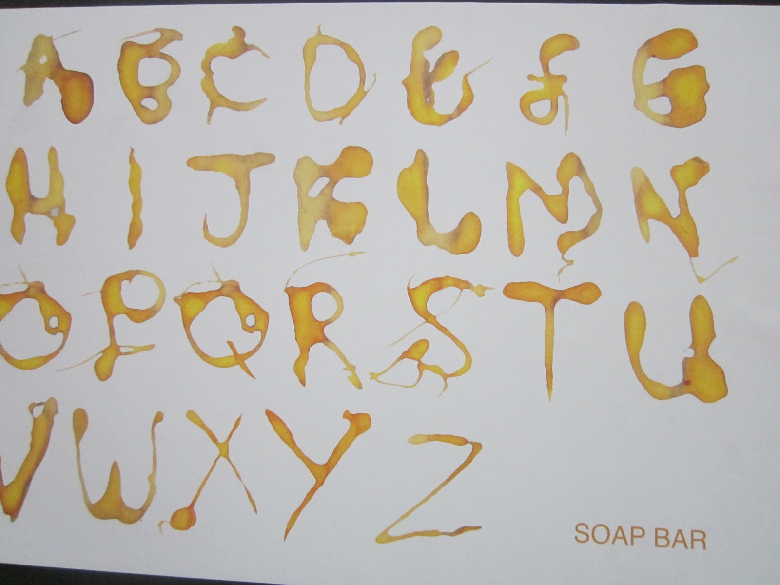
This was a graphic design project, which was to create our own typeface. I created mine based on fairly liquid squirting straight out the bottle. I edited it on Photoshop to enhance the color, and gain the contrast.


This was another graphics project, which was creating a double page spread based on the number '7'. I decided to base it on a mountain bike track in coed y brenin called the seven sisters. There are 7 vectored bikers, 7 letters in the word 'sisters', the track has been made out of 7's and also 7 different typefaces, and also there are 7 sentences describing the track on each section.


This was a print making project, which i based it on my environment, which i focused a lot on the urban side of were i live, and also the nice scenery places, to show the difference. I created a book showing my best prints, by linking thick paper strips together and joining to the end of card, and the created a holder made out of one of my prints, which can slip on and of.


This is a life drawing created by the majority of charcoal, mixed in with some colored pastels, on a orange colored piece of paper.


This was a photography project based on our trip in Barcelona with the college. The top two images are a mixture of two images layered on top of each other with the opacity changed. The middle image has been tinted slightly with a yellow, and the bottom image of the building has been created in to a silhouette.


This is some of my FMP (final major project) project. the top image is the logo i created for my step fathers business, who is a sign writer and printer. followed by his business card on the bottom image, and also a t-shirt design at the bottom to promote his business even more.


This is a book cover we had to create based on Barcelona again. I used two similar images in the background, and changed the opacity of them to make it look like there one image in a weird way.


This was a typeface exercise we did, with different letters and typefaces photocopied large, and we would draw parts of the type we like, using pastels on a large scale (A1).


Tuesday 20 November 2012

10. Jonas Bendiksen


This here was created by a photographer called Jonas Bendiksen. What I like mainly about this piece is the composition of the photo. To me it looks very graphic in a way by how straight everything is, by the lines of the building and each of the square and rectangle shapes.
  I also like the different sets of colours within the building, to me I think the bright lighting makes the photo stand out and makes it more interesting by the difference in lighting and darkness. 

9. Salvador Dali


This was a painting that I saw in Barcelona on a college trip.
   What I like about his painting is how energetic it looks by the way he uses ink in such a fast and almost rushed way, but ends up with a very detailed and clear painting in ink.
   I also love his ‘Dali’ signature the way it’s so fast and the way the ‘D’ looks like it’s splattering away, to me it looks really interesting. To me this looks like a positive and negative type of painting by the way Dali’s not used a lot of ink on it, this to me is a very clever technique.

8. Nike ( just do it )


What I like about this is not necessarily the image but the message that comes across, As its saying ‘ just do it ‘ which you have this young boy taking a pee on the wall because to me its like the dogs telling him to just do it as well by the way he is looking at the boy.
   In my opinion this is a very clever piece of graphic imagery by the message that is coming across and the image of it fitting the ‘saying’ perfectly in my view. 

7. Walt disney illustration


As a child I have always like Disney characters, especially Mickey Mouse. As I got a bit older I bought a book on how to sketch all of the Disney characters.
   I have always liked these illustration types of drawings as to me they look very sketchy, and that’s what I like. Its also a reminder of when I was small always sketching these types of characters. What I also like about these sketches is that these are the start of the cartoon; to me this shows how important sketching is, and how ideas can develop a lot further from having an idea and sketching them.

6Joan Miro – Hands flying off towards the constellations


This was also another painting I saw in Barcelona in a museum full of Joan Miro’s work.
   I really like this as to me it looks very graphic which is what I’m interested in, and I also like the splash marks, it looks a little graffiti to me, which makes it interesting with his handprints placed in various places. I also like the usage of colours he’s used, using many dark colours like the black and different shades of grey, but then adding a small amount of blue, yellow and the slightest of red to make the piece of work stand out a lot more than it would otherwise.